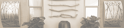

Color Basics: Image shows two shades of a color for definition.
COLOR BASICS I.
Some of the most frequently asked design questions center around color – especially paint colors. Questions like: “Where do I start?”; “I like them all – which one should I choose?”; “How can I tell from this tiny color swatch if it will look right in my space?”. In this series of articles on color I will walk you through some strategic color basics and some practical tips to take with you to the paint store.
Color Selection
So, if you have a paint deck in your hand and you are wondering where to begin….
Step One: Determine how many color selections you will be required to make per room. These usually are walls, ceilings, trim for doorways + doors, base crown and moldings, and possibly accent walls.
Step two: Start with the walls of one room at a time. The first area should be the most prominent room and/or the room that flows most frequently into the rest of the space (Lobby, living room or family room, or any area that shares walls and a ceiling).
Step three: Ask yourself these three important questions for each room.
1.What will this room be used for the most? Entertaining/Family time/ Eating/ Conference/ Office work?
2. Is it predominantly a daytime or night time use room or both?
3. Does it get a lot or a little light or someplace in between, and does this tend to make the space feel hot or cold?
Once you have established these things you will begin to narrow down your choices. Then you need to add to your list (for each area) what you would like that space to feel like i.e.; cozy, formal, quiet, exciting, stimulating, impressive, etc. Remember that this list is just for you – so there is nothing that is too honest here. If you want to make a statement to impress people, or make it a short stay in a guest bathroom, those are viable options – be fearless!
So far your list will look something like this per area.
(1.) Prominent area : Great room /Entry hallway/ large connecting wall into Dining area.
- Walls
- Ceiling(s)
- Trim – base molding, dining room archway, 3 doors and frames.
- Accent wall – long wall connecting into Dining room.
Great room and entry hall: low natural light in hallway/ medium light in living room – windows that look into a court yard (shielded by balcony overhang). Areas feel cool.
Used for: Entertaining and holidays/ Mostly evenings-night use, but seen during the day from hall and Dining areas
Desired affect: formal, stimulating, impressive
Qualify the Style of Your Space
At this point you need to qualify the style of your space. Is it traditional, contemporary, eclectic, ultra-modern, or transitional ? Let us say for this lesson that our hypothetical Great room has transitional (a mix of old and new) furniture and drapes, and is carpeted with a Persian rug in reds and golds. The sofa is cream colored and is large and square backed with modern accent chairs covered in a deep honey-gold suede; already a somewhat formal room that is well on its way to being impressive.
These qualifiers will also help you to bring into perspective what colors should go where. The key to dividing or uniting a spatial plan through color is flow and accent complements that create spatial definition. This could be as simple as a strong contrast between the wall color and the trim or a complex use of multiple colors and accent walls; a decision which depends on the configuration and style of the architecture and the layout of the space. For example, more traditional or transitional spaces often have a medium to medium dark wall color with high contrast light gloss trim (which often includes crown moldings if the ceilings are high enough to warrant it). You will decide on which colors work for which areas based on the information that you have gathered; which includes the style of the architecture, the style of the décor, the size and height of the room(s), and if the rooms are separated or flow into one another without an obvious break. You will then add this to your list per room.
- Walls – living room and hallway – all same color (warm neutral – flat)
- Ceiling (s) – same color for all downstairs areas except powder room (neutral – flat).
- Trim – base molding, dining room archway, 3 doors and frames (neutral semi-gloss).
- Accent wall – long wall connecting into Dining room ( color – possibly green or cognac- flat).
Color Science
Continuing with color basics, let’s learn a little about color science before we return to our project. Color can be evaluated in four basic ways.
Warm colors – reds, yellows, oranges, pure or hot pinks, fuchsias, rusts. Warm neutrals are called Tans.
Cool colors – Blues, greens, purples, magenta, aqua and turquoises. Cool neutrals are called Taupes.
Value scale – is how light or dark a color is.
Hue scale – is how bright or dull a color is.
Most color palettes combine a mixture of all these basics because this is what creates depth. Warm colors tend to come forward while cool colors recede. A dull or “grayed out” hue is a good background to a punch of bright color – especially when those colors are complementary colors. These complementary colors are found on the opposite side of the color wheel from each other. Red is across from green; purple is across from yellow; and blue is across from orange. Equally, each shade in that paint deck of yours has its opposite. For example; a medium turquoise (blue/green) is the complementary of a medium rust (orange/red), or a pale lavender is the opposite of cream corn yellow. A burgundy (blue/red) is the opposite of olive green (orange/green). Tricky but true.
The value of a color will also affect how successful a palette is. Mixing up the values not only creates more depth in a room, it also creates the weight and volume in a space. A dark piece of furniture, though not any larger than other pieces in the room, will often carry more visual weight. The same is true of an accent wall in either a deep value or combined with a strong hue (think pine green or deep magenta). Counter to the intuitive, a deep accent wall often makes a room feel larger not smaller. So, dark colors don’t always close a room in. This, of course, depends on where the wall is and also how large it is compared to the other elements in the room. Design is all about balance!
Applying Color Basics
Now that you have learned a little about color basics, let’s see how this applies to your paint project.
Great room/ formal room conditions: cool, medium lighting, formal, stimulating, impressive, both day and night use for entertaining. Hallway and accent wall are adjunct parts of the color scheme.
Considerations: height of ceiling, accent colors already present (carpet, drapes, furniture, flooring), style of architecture and architectural detailing (moldings, light fixtures, archways).
Now, address these conditions with the corrective or additive color type. This will help you to know where to look in your paint deck for the final color.
Cool= bring in a warm color choice to make the room feel less cool.
Med. Lighting = a medium light quotient goes with a medium paint color (on a scale of 1-10 light to dark your choice will be about a 3-5 which is the medium range)
Formal and stimulating = sophisticated neutrals or not very saturated earthy colors. Puce/ beige/ sienna/ sage (all grayed or washed out colors – like faded denim). FLAT (velvety) paint.
Impressive= Grayed out but still a rich under tone like a gold taupe (the color of cognac).
Both day and night= a medium to medium light room. Lighter side if the ceiling is lower than 10 feet high. The room should look cooler by day and warmer at night under incandescent lighting.
Hallway = The same color will appear darker in the hallway, but will be the shade needed for value balance.
Accent wall color choices= based on detail colors in the room or their complementary colors. Example: red and gold carpet with honey gold suede chairs – accent wall of dusty heather (gray lavender) in a medium to medium dark shade. Or an accent wall of teal turquoise but grayed out to a colonial “dirty” blue (dull hue) of a medium-dark value to complement the rust red in the carpet – Or perhaps, a deep/dull apricot to tie all of the colors together (as if they were all mixed in a blender). A few more ideas would be a deep and dusty peridot green or a rich cognac color depending on the main wall and trim colors.
Ceiling and trim = Both modern and traditional formal rooms benefit from light (though not necessarily bright) trim and ceiling colors. For our room, I would choose a soft, warm white that complements the wall colors and also provides a value contrast to them. A white that is too cool will appear gray next the palette described above. Formal and impressive palettes require value contrast, richness of hue (even in whites), and a sheen to the trim – usually semi-gloss. High gloss seems to only work in very traditional or ultra-modern settings.
Coming next in the color basics series – How to see color, how to match color, and how to get what you want from the paint store!
Martha Channer MC2 The Science Of Design 2017
MARTHA CHANNER is co-owner of MC² The Science of Design, an interior design company that specializes in custom design, space planning, and fine art installations.
She received her BFA in painting and printmaking, with a minor in Art history, from Barat College in Illinois. She also attended The School of the Art Institute of Chicago, where she studied spatial design, sculpture, and paint applications. She is a performance artist, fine art painter, and choreographer, which she incorporates into her large scale installations and exhibitions. Her work is shown nationally in galleries and museums.