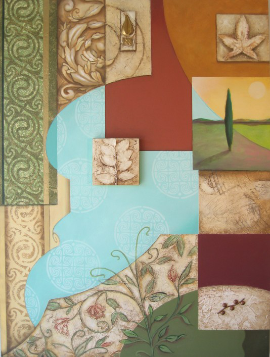
Language of Color: Image of a Celtic panel that illustrates the importance of color choices. By Martha Channer.
Language of Color Series: Seeing in color
You have probably wondered, when looking at a piece of art, why the artist made certain choices. Why did Picasso have a blue period? Why did the impressionists paint in that pastel, high-key color palette? Why did Rothko paint color field paintings that were just washes of color with no representational imagery? One way to answer these questions is to discuss the language of color and how it determines hue choices and the application style in all art – especially painting.
Color Choices
The foundation of effective color choices (though often made intuitively by the artists) are based on three primary factors:
– Color as a subliminal messenger to evoke the intended response in the viewer; which is the way that the language of color “speaks” to you and thus invokes a reaction.
– Color as an emotional way to grab and hold the viewer’s attention, whether in a positive or negative context. It is not necessary to like a piece of art to be riveted by it.
– Color as an intuitive qualifier that sets the tone and explains (usually under the radar) what the art piece is about. Even if you do not understand the art intellectually the language of color will help you to “get it” intuitively. Art is often not meant to be understood with the intellect.
Creating high level works of art requires at least 10,000 decisions. Many of these decisions are color related. Unexamined color choices in a painting, or any work of art, will immediately identify it as the work of an amateur. Color is a science. So how can you determine if you are looking at, buying, or admiring a really good piece of art? The secret is in the secondary color layers and what vibration they are setting you up to see through your subliminal, emotional, and intuitive faculties.
Granted, we have no way of knowing if we are all seeing the exact same color. The language of color helps us here. There are probably shades and nuances that are different for all of us. However, we can usually agree on such qualifiers as turquoise blue or orange as opposed to red. The difficulty arises when color starts incorporating qualifiers like chartreuse or puce, or a green/violet purple. The good news is that you do not have to know the theory behind the mixing or layering of these colors in order to enjoy them. But if you want to know how to see them, you must acquaint yourself with the language of color.
The Language of Color
Before we get back to how these colors are designed to affect you, let’s define those secondary and tertiary colors just mentioned. Chartreuse is a bright, golden green that evokes the feelings of spring time, wealth, joy and clarity. Puce is a dull or sometimes faded dark red because it is meant to imitate a dried bloodstain left on a linen sheet (presumably as a result of flea bites since puce means flea in French). A green/violet purple is like an eggplant skin because it is a blue purple but has green undertones (all fruits and vegetables have some green in them). The most efficacious use of this color in painting is achieved by layering dioxazine purple with a thin transparent overlay of phthalo green. These are examples of the secondary colors that have the power to affect you in subtle and powerful ways and here is why.
In nature color never stands alone. The language of color is reflected in light; in striations and variegated colors; light and shadows; and compound elements that blend together to create a huge variety of colors. For example, light and how it illuminates its object was the whole premise behind the impressionist movement. In a later era, Joseph Albers defined this in a more clinical, modern way with his color theory paintings that demonstrated that color is relative to its surroundings. The clearest proof of this is shown when you put turquoise (a blue/green) against a true blue and a true green background. Against the blue the turquoise will look green – against the green it will look blue. In other words color fluctuates depending on the quality of the light and what it is next to. You have witnessed this millions of times – but you may not have been consciously aware of it.
When artists take cues from the natural world and our involvement with it this includes utilizing color for affect. In fact, no artist can ever get away from the laws of physics or how we perceive reality – no matter how abstract the art. Color or the absence of it will always qualify the statement.

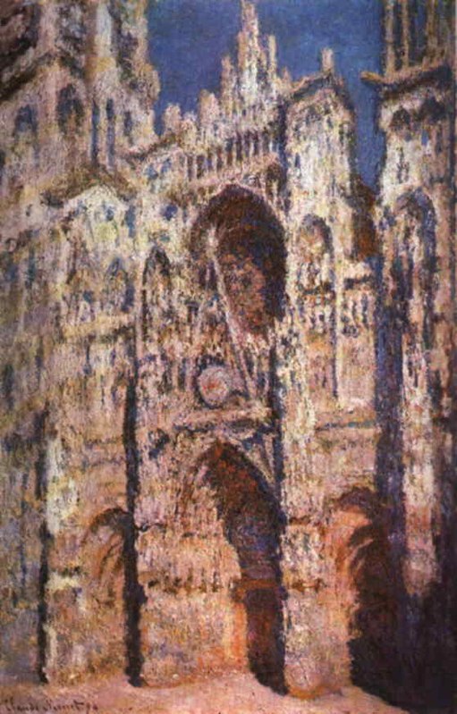
Language of Color: Monet painting illustrates how color captures the different effects of light on their surfaces. By Claude Monet
Monet painted the cathedrals and his Giverny lily pond over and over again to capture the different effects of light on their surfaces and on the surrounding areas. This included the shadow play and temperatures; the season; the weather; and his perception. He felt that creamy, pastel tones in various stages of deepening tonality best described how light actually moves across the hours. Bright noontime sunshine bleaches out color and underlines things with shadow; when we see this in a painting we actually feel the presence of that hour, its attending warmth, and whatever associations we bring to those sensations. Color has the power to speak to us based on its prominent place in the survival of our species, which again takes us back to nature.
To say that color is primal is the very basis of its subliminal power. This is why we agree that red means stop and green means go. Those ancestors that understood that a bright red berry meant poisonous lived to pass on that genetic memory in our DNA encoding. Those of us that eat a lot of greens are healthier. Visually, color creates depth perception and differentiates one thing from another; which is very handy when you are running from a predator. One could say that the orange tiger’s stripe is both camouflage and also the very thing that screams danger when seen in the wild. Whether you realize it or not, color has kept you alive more than once.
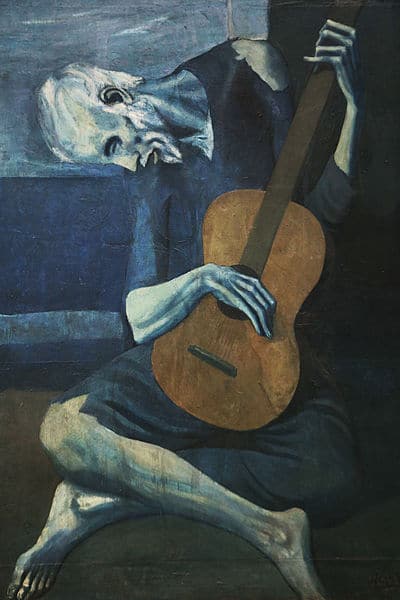
Picasso was well aware of the feelings and primal associations with the color blue. His “blue period” existed to explore this fully and to learn a profound appreciation for how this particular color affects us. However, he also understood that this could not be achieved without the complimentary and analogous colors that provided the range of blues to be examined. if you look at any of his “blue period” paintings, such as The Old Guitarist, you will see that there are many secondary tones, hues, shades, and values included in the paintings.

Language of Color: This painting shows how secondary colors create subliminal associations and evoke emotion. By Pablo Picasso
Application Style and Secondary Colors
The secondary colors, such as the golds and oranges, are juxtaposed against the blues and also mixed into them. Secondary color gives the over-all emotional quality of age, depth, remembrance, regrets, suffering, and yet the poignant satisfaction that mastery of a vocation brings.Think of the saying “still waters run deep” and what that has to do with blue, poverty, contemplation, maturity, and calm. This is how Picasso chose what he would paint in blue. He understood our subliminal associations to the color and how to evoke emotions from us with it. He also understood that we would understand all of this intuitively through the language of color without anyone having to tell us. Imagine this same image in black and white and observe the emotional impact that it loses.
Secondary color doesn’t have to be connected to recognizable imagery in order for it to work its magic on us. It can just be fields of color that resonate that dialogue.
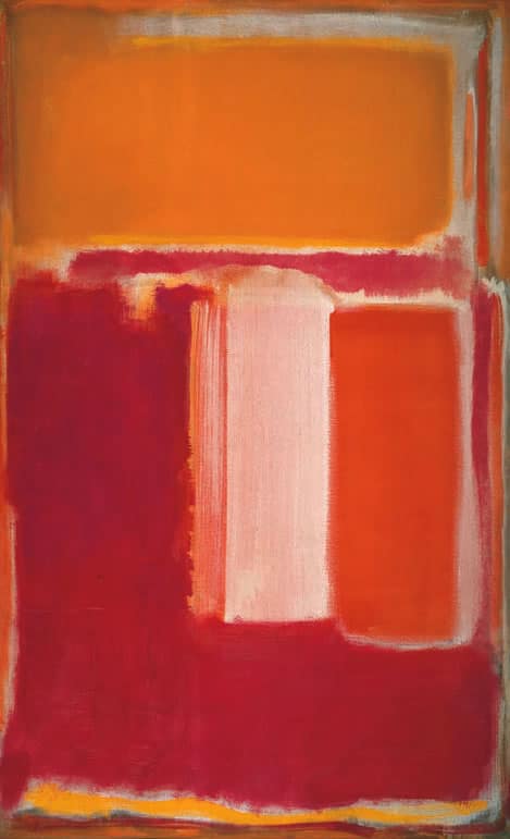
Mark Rothko was a master at this. His washes of layered color took this theory to a new level of purity and simplicity. Through layering already mixed and balanced colors, he created more complex/mixed colors. By doing so his work is able to affect us subliminally, emotionally, and intuitively with color alone: a positive proof that it is the color, not necessarily the imagery, which is responsible for the ineffable and ephemeral interpretations that we perceive. This is the language of color in its most basic yet most exalted form. It is a pure abstract interpretation of the way that we see color in our everyday lives – mixed, layered, and varied – like looking at sunshine through the leaves of a tree in Autumn.

Language of Color: This painting also shows secondary colors can be fields of color that resonate with emotion. By Mark Rothko
Though I am talking about famous works of art that most of us will recognize, the same principles apply to any works of art or design. It is easy to get bogged down in the mechanics of art and art history and to assume that non-artists cannot possibly understand the “right” way to see and evaluate art. This is untrue. Nature has evolved all of us to understand and respond to color. Even those without physical sight have accurately described the sensations of yellow or blue through the effects of sunshine and water. Color is continually speaking to us in that non-verbal language that we all recognize. It is constantly providing nourishment, depth, discernment, and content. But, it is up to us to listen.
Martha Channer/ November 2017
MARTHA CHANNER is co-owner of MC² The Science of Design, an interior design company that specializes in custom design, space planning, and fine art installations.www.mctwodesign.com.
She received her BFA in painting and printmaking, with a minor in Art history, from Barat College in Illinois. She also attended The School of the Art Institute of Chicago, where she studied spatial design, sculpture, and paint applications. She is a performance artist, fine art painter,and choreographer, which she incorporates into her large scale installations and exhibitions. Her work is shown nationally in galleries and museums. www.marthachanner.com

